Ionic4 Datepicker Component is our first contribution to Ionic4 Open Source Community. In Ionic1 for
Datepicker there was a nice option provided by rajeshwar patlolla’s Ionic1 Datepicker. But while I searched for a similar option, I found that either they are not compatible with angular or their use case is not match up with what we required. So then we decided to build something our own, we have implemented it nicely in our project, then we thought to make it as a library and make it open source. Ionic4 Datepicker Component is still in development in terms of configuration options and functionality.
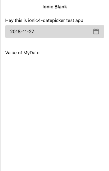
Currently here is how it looks like:-
How to Use it
Step1: Install
npm i @logisticinfotech/ionic4-datepicker moment
Step2: Import it in your module and in import array
import { Ionic4DatepickerModule } from
    '@logisticinfotech/ionic4-datepicker';

@NgModule({
  imports: [
    CommonModule,
    FormsModule,
    IonicModule,
    Ionic4DatepickerModule,
    RouterModule.forChild([
      {
        path: '',
        component: HomePage
      }
    ])
  ],
  declarations: [HomePage]
})
Step3: In your component declare your model variable and date picker options
myDate = 'YOUR_DATE'; (assign your selected date to this Object)
let disabledDates: Date[] = [
      new Date(1545911005644),
      new Date(),
      new Date(2018, 12, 12), // Months are 0-based, this is August, 10th.
      new Date('Wednesday, December 26, 2018'), // Works with any valid Date formats like long format
      new Date('12-14-2018'), // Short format
];
datePickerObj: any = {
  inputDate: new Date('2018-08-10'), // default new Date()
  fromDate: new Date('2016-12-08'), // default null
  toDate: new Date('2018-12-28'), // default null
  showTodayButton: false, // default true
  closeOnSelect: true, // default false
  disableWeekDays: [4], // default []
  mondayFirst: true, // default false
  setLabel: 'S',  // default 'Set'
  todayLabel: 'T', // default 'Today'
  closeLabel: 'C', // default 'Close'
  disabledDates: disabledDates, // default []
  titleLabel: 'Select a Date', // default null
  monthsList: ["Jan", "Feb", "March", "April", "May", "June", "July", "Aug", "Sept", "Oct", "Nov", "Dec"],
  weeksList: ["S", "M", "T", "W", "T", "F", "S"],
  dateFormat: 'YYYY-MM-DD' // default DD MMM YYYY
  clearButton : false , // default true
  momentLocale: 'pt-BR', // Default 'en-US'
  yearInAscending: true, // Default false
  btnCloseSetInReverse: true, // Default false
  btnProperties: {
    expand: 'block', // Default 'block'
    fill: '', // Default 'solid'
    size: '', // Default 'default'
    disabled: '', // Default false
    strong: '', // Default false
    color: '' // Default ''
  },
  arrowNextPrev: {
    nextArrowSrc: 'assets/images/arrow_right.svg',
    prevArrowSrc: 'assets/images/arrow_left.svg'
  }, // This object supports only SVG files.
  highlightedDates: [
   { date: new Date('2019-09-10'), color: '#ee88bf', fontColor: '#fff' },
   { date: new Date('2019-09-12'), color: '#50f2b1', fontColor: '#fff' }
  ] // Default [],
  isSundayHighlighted : {
   fontColor: '#ee88bf' // Default null
  } // Default {}
};
Available Options are:
- inputDate(Optional) Date: If default date is not provided and want to start Datepicker at
specific Month/Year, You can give the date in Date | string | moment object to this property.
Default value is new Date(). Once the date is set then this property will be ignored. - fromDate(Optional) Date: if provided date object here, previous dates from this date will be
disabled. - toDate(Optional) Date: if provided date object here, future dates from this date will be
disabled. - showTodayButton(Optional) Boolean: boolean parameter relates to Today button hide/show, default
value is true. - closeOnSelect(Optional) Boolean: very useful option to understand. Its default value is false. If
it’s false Set button will be visible, and the user has to click on Set to close model and get selected
date value. If it’s True, the Set button will be hidden and On Selection of Date, Model will be
automatically close and Date value will be passed to our component. - disableWeekdays(Optional) array: Accepts number array 0(Sunday) to 6(Saturday).
eg. [0, 3, 6] this will disable Sunday, Wednesday, Saturday in the whole calendar. - mondayFirst(Optional) Boolean: To show Monday as the first day Set to true. The default value is
false, which means Sunday is the first day by default. - setLabel(Optional) Label: The label for the Set button. The default value is “Set”.
- todayLabel(Optional) Label: The label for Today button. The default value is “Today”.
- closeLabel**(Optional) Label: The label for Close button. The default value is “Close”.
- disabledDates(Optional) array: pass dates array if you like to make them disable from the
selection. - titleLabel(Optional) Label: By default, no title will be shown. If passed it will set model
title. - monthsList(Optional) array: To change the language or change month texts. You can create an array
like below:
[“January”, “February”, “March”, “April”, “May”, “June”, “July”, “August”, “September”, “October”,
“November”, “December”];
The default values are:
[“Jan”, “Feb”, “March”, “April”, “May”, “June”, “July”, “Aug”, “Sept”, “Oct”, “Nov”, “Dec”]; - weeksList(Optional) array: To change the language or change week text. You can create an array like below:
[“Sun”, “Mon”, “Tue”, “Wed”, “thu”, “Fri”, “Sat”];
The default values are: [“S”, “M”, “T”, “W”, “T”, “F”, “S”]; - dateFormat(Optional) String: This is the format used in the template. Defaults to `DD MMM
YYYY`. For how to format date, and which format is accept see
below site: https://angular.io/api/common/DatePipe
From version 1.0.8 moment js is implemented so please check here for valid date
formats - clearButton(Optional) Boolean: Boolean to specify whether to show the `x` button in ion-input or
not, which will be used to clear value. the default value is true. - yearInAscending(Optional) Boolean: Default value is false, if set to true years drop down will
show years in ascending order. - momentLocale(Optional) String: Default value is `en-US`. So if you would like to use ’06 Fev 2019
‘ and formate is DD MMM YYYY then you need to set momentLocal:’pt-BR’ in order to make it work. - btnCloseSetInReverse(Optional) Boolean: Default value is false , if set to true then buttons
sequence will be Set/Close instead of Close/Set. - btnProperties(Optional) Object: this object set the button defaults properties like expand, fill,
size, disabled, strong, and color. Default object of button properties as below :
btnProperties:
{
expand = ‘block’; // “block” | “full”
fill = ‘solid’; // “clear” | “default” | “outline” | “solid”
size = ‘default’; // “default” | “large” | “small”
disabled = false; // true | false
strong = false; // true | false
color: ‘primary’ // “primary” | “secondary” | “tertiary” |
// “success” | “warning” | “danger” | “light” | “medium” | “dark”
} - arrowNextPrev(Optional) string: This property is to set src for the icon of next and previous
button. This option reacts on only `SVG` files. In this option, we should write the path of SVG files.
Default is set to arrow-back and arrow-forward. - highlightedDates(Optional) array: Using this property we can highlight the dates in
datePicker.So, we can easily find selected dates in datePicker. In this, we can pass the date and color
which you can use for highlight date.
for example :
highlightedDates: [
{ date: new Date(‘2019-09-10’), color: ‘#ee88bf’, fontColor: ‘#fff’ },
{ date: new Date(‘2019-09-12’), color: ‘#50f2b1’, fontColor: ‘#fff’ }
] - isSundayHighlighted(Optional) object : Using this property we can hightes all sunday of month, and you can set any color for highlight sunday.
for example :
isSundayHighlighted :{
fontColor: ‘red’
}
Step4: Then in your html simply use it as below
Use Ionic4-datepicker As a Directive (Preferred)
<ion-input readonly [(ngModel)]="mydate"
    [liIonic4Datepicker]="datePickerObj"
    (ionchange)="myFunction()">
</ion-input>
Use Ionic4-datepicker As a Component
<li-ionic4-datepicker [(ngModel)]="mydate"
    [inputDateConfig]="datePickerObj"></li-ionic4-datepicker>
Programatically way
Please follow as below to open Datepicker Modal and get date onDismiss. (standard ionic way ModalController
implementation)
import { Component, OnInit } from '@angular/core';
import { ModalController } from '@ionic/angular';

import { Ionic4DatepickerModalComponent } from 'ionic4-datepicker';

@Component({
  selector: 'app-datepicker-button',
  templateUrl: './datepicker-button.page.html',
  styleUrls: ['./datepicker-button.page.scss'],
})
export class DatepickerManuallyPage implements OnInit {

  datePickerObj: any = {};
  selectedDate;

  constructor(
    public modalCtrl: ModalController
  ) { }

  ngOnInit() {
    this.datePickerObj = {
      dateFormat: 'YYYY-MM-DD'
    };
  }

  async openDatePicker() {
    const datePickerModal = await this.modalCtrl.create({
      component: Ionic4DatepickerModalComponent,
      cssClass: 'li-ionic4-datePicker',
      componentProps: {
         'objConfig': this.datePickerObj,
         'selectedDate': this.selectedDate
      }
    });
    await datePickerModal.present();

    datePickerModal.onDidDismiss()
      .then((data) => {
        console.log(data);
        this.selectedDate = data.data.date;
      });
  }
}
Note: For model to open as above image please add below css in your projects global.scss
.li-ionic4-datePicker {
    .modal-wrapper {
        height: 470px;
        max-height: 100%;
        width: 312px;
    }
}
Want to use different color schema? please put css as below example to affect only inside datepicker modal.
Basically you can override all ionic theme variables here and it will automatically apply accordingly.
.li-ionic4-datePicker {
  .modal-wrapper {
      height: 470px;
      max-height: 100%;
      width: 312px;
      --ion-color-primary: red; // This Variable used for the change of colour ion-datepicker only.
      --ion-color-primary-tint: rgb(214, 153, 153); // This Variable changes the tint colour of background when click button.
      ion-button {
          // --ion-color-primary: green; // This Variable used for the change colour of buttons only.
          // --ion-color-primary-tint: lightgreen; // This Variable changes the tint color of background when click buttons.
          // --border-radious: 0px; // This Variable changes the border radious of buttons.
          // button customization css write here...
      }
  }
}
Please post any issue you found in GitHub or in the comment box below. Also request feature if you like to see it in this library.
This is our first Ionic/Angular Library so please suggest any improvements in code base also.
Looking forward to get community feedbacks.
# Breaking change in version 1.0.8
Due to issue in date formate `dd-MM-yyyy`, we have used moment js to solve it. Now this need to be
changed to `DD-MM-YYYY`
We are moving away from angular DatePipe so now only moment js date formats are valid.
so people who are using `dd` will require change it to `DD`
Change Log
Version: 1.1.0
> added option: yearInAscending
> added option: momentLocale
> github issue #8 solved
Version 1.3.0
> added option: arrowNextPrev
For documentation please check above description
> github issues #17 is supported
> Added in built scroller to select Month and Year. To go back user can tap on titlebar.
Version 1.4.1
> Now if input is blank then current date will not be selected by default.
> fixed issues #28
Version 1.4.3
> Highlighted all Sunday of month support added.
> fixed issues #37
Version 1.4.4
> padding to ion-padding class updated
Example repo you can find here ionic4-datepicker-example

