Hello Guys, here is our another contribution as Ionic Time Picker component to Ionic4 Open Source Community. Earlier we created Ionic Datepicker component. In Ionic1 for Time Picker a nice option provided by rajeshwar patlolla’s Ionic1 Timepicker. We have took concept from that and designed with little new interface and as easy as possible for users to access and developers to implement.
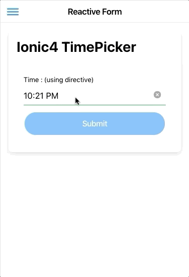
Currently here is how it looks :
How to Use it
Step1: Install
npm i @logisticinfotech/ionic-timepicker moment
Step2: Import it in your module and in import array
import { IonicTimepickerModule } from
'@logisticinfotech/ionic-timepicker';

@NgModule({
  imports: [
    CommonModule,
    FormsModule,
    IonicModule,
    IonicTimepickerModule,
    RouterModule.forChild([
      {
        path: '',
        component: HomePage
      }
    ])
  ],
  declarations: [HomePage]
})
Step3: In your component declare your model variable and time picker options.
myTime = 'YOUR_TIME';
// (please assign time with proper format which is describe below)
this.timePickerObj = {
    inputTime: '11:01 PM', // for 12 hour time in timePicker
    timeFormat: '', // default 'hh:mm A'
    setLabel: 'Set', // default 'Set'
    closeLabel: 'Close', // default 'Close'
    titleLabel: 'Select a Time', // default 'Time'
    clearButton: false, // default true
    btnCloseSetInReverse: true, // default false
    momentLocale: 'pt-BR', //  default 'en-US'

    btnProperties: {
        expand: '', // "block" | "full" (deafault 'block')
        fill: '', // "clear" | "default" | "outline" | "solid"
                 // (deafault 'solid')
        size: '', // "default" | "large" | "small" (deafault 'default')
        disabled: '', // boolean (default false)
        strong: '', // boolean (default false)
        color: ''
        // "primary", "secondary", "tertiary", "success",
        // "warning", "danger", "light", "medium", "dark" ,
        // and give color in string (default 'primary')
      }
    };
Available Options are:
- inputTime(Optional) : If default time is not provided and want to start Timepicker at specific time, You can give time in Date | string | moment object to this property. Default value is new Date(). Once time is set then this property will be ignored.
- timeFormat(Optional) String: all moment time formats are valid. Default value is ‘hh:mm A’
- setLabel(Optional) : The label for Set button. Default value is `Set`.
- closeLabel(Optional) : The label for Close button. Default value is `Close`.
- titleLabel(Optional) : Optional title for the modal. If omitted or set to null, title will default to `Time`.
- clearButton(Optional) Boolean: Boolean to specify whether to show the `clearButton` or not , which is used to clear value. Default value is `true`.
- btnCloseSetInReverse(Optional) Boolean: Boolean to specify whether to switch buttons over from Close / Set to Set / Close. Default value is `false`.
- btnProperties(Optional) String: Object set the button defaults properties like `expand`, `fill`, `size`, `disabled`, `strong`, and `colour`. Default object of buttonProperties is in above timePickerObj.
- momentLocale(Optional) String: Default value is ‘en-US’, we can pass something like ‘ar’ or ‘pt-BR’ for fully localisation.
Step4: Then in your HTML simply use it as below
Use Ionic-datepicker As a Directive (Preferred)
<ion-input readonly [(ngModel)]="mytime"
   [liIonicTimepicker]="timePickerObj"
   (ionchange)="myFunction()">
</ion-input>
Use Ionic-datepicker As a Component
<li-ionic-timepicker [(ngModel)]="mytime"
[inputTimeConfig]="timePickerObj"></li-ionic-timepicker>
Note:
For model to open as above image please add below css in your projects global.scss
.li-ionic-timepicker {
    .modal-wrapper {
        max-height: 276px;
        width: 310px;
        min-height: 0;
        border-radius: 0px;
        --ion-color-primary: #f9a200;
        // This Variable used for the change of colour
        // ionic4-timepicker only.
        // --ion-color-primary-tint: rgb(214, 153, 153);
        // This Variable changes the tint colour of background
        // when click button.

        ion-button {
            // --ion-color-primary: green;
            // This Variable used for the change colour of buttons only.
            // --ion-color-primary-tint: lightgreen;
            // This Variable changes the tint color of background
            // when click buttons.
            // --border-radious: 0px;
            // This Variable changes the border radious of buttons.
            // button customization css write here...
        }


    }
}
Please post any issues you found in GitHub or in the comment box below.
Also, request a feature if you like to see it in this library.
Looking forward to getting community feedback.

