
While dealing with Calendar or Date we are always looking for some unique way of implementation. There are numerous ways to implement Calendar or Date picker with your React Native application. In this article, you will learn about Horizontal Date picker and how to integrate React Native horizontal date picker library with your project. It is very simple and easy to integrate with your existing code to get unique way implementation of Calendar.
Most of the time the design for Calendar view is Monthly. But, sometime in your project, you require another view instead of the full Month Calendar view. Here I have developed single line scrollable Calendar view.
During development, I came across this situation and I have two options either use other Calendar Week view library or create own component with required functionalities. So finally, I have made my own date and time picker component using the FlatList.
How to use this Horizontal Date Picker?
Here you will find step by step guide to integrate this component with your project and detail about each props being used.
Step 1: Installation
// npm library
npm i @logisticinfotech/react-native-horizontal-date-picker
Step2: Import in your code
import HorizontalDatePicker from ‘@logisticinfotech/react-native-horizontal-date-picker’

…

onDateSelected = date => {
	console.log(“Selected Date:==>”,date);
}

…


<HorizontalDatePicker
	pickerType={‘date’}
	onDateSelected={this.onDateSelected}
	/>
…
This is how to use other property from library
…

onDateSelected = date => {
	console.log(“Selected Date:==>”,date);
}

onTimeSelected = time => {
	console.log(“Selected Time:==>”,time);
}

onDateTimeSelected = datetime => {
	console.log(“Selected Time:==>”,datetim);
}

…

<HorizontalDatePicker
	pickerType={‘datetime’}
	minDate={new Date()}
	defaultSelected={new Date()}
	datePickerBG={require(‘./dateBG.png’)}
	timePickerBG={require(‘./dateBG.png’)}
	dayFormat={‘DD’}
	monthFormat ={‘MMM’}
	yearFormat ={‘YY’}
	timeFormat ={‘HH:mm a’}
	timeStep={120}
	returnDateFormat={‘Do MMMM YY’}
	returnTimeFormat={‘hh:mm a’}
	returnDateTimeFormat={‘DD-MM-YYYY HH:mm’}
	onDateSelected={this.onDateSelected}
	onTimeSelected={this.onTimeSelected}
	onDateTimeSelected={this.onDateTimeSelected}
	/>

…
Properties
pickerType(optional) String:
It’s for type of picker display. Options are “date”, ”time” and “datetime”. Default option is “date”.
minDate(optional) Date:
This one is for start the date of date picker. Default is set to current date.
maxDate(optional) Date:
This one is for maximum limit you want to display date in date picker. Default is 3 months from current date.
defaultSelected(optional) Date:
This is the default selected date. By default is set to minDate.
datePickerBG(optional) Object or Reference:
You can set background image by using this props. Default there is no image set.
timePickerBG(optional) Object or Reference:
It’s to set background image, default there is no image set.
dayFormat(optional) String:
This is used to display date format in date picker. The values are as per standard of moment JS. Default value is ‘Do’.
monthFormat(optional) String:
This is used to display month format in date picker. The values are as per standard of moment Js. Default value is ‘MM’.
yearFormat(optional) String:
This is used to display year format in date picker. The values are as per standard of moment Js. default value is ‘YYYY’.
timeFormat(optional) String:
This is used to display time format in date picker. The values are as per standard of moment Js. Default value is ‘HH:mm’.
timeStep(optional) Number:
This is used to divide time into steps in minutes for eg. if you want to divide time in 1 hour of steps then pass 60 minutes it will divide time in 1 hr of steps.
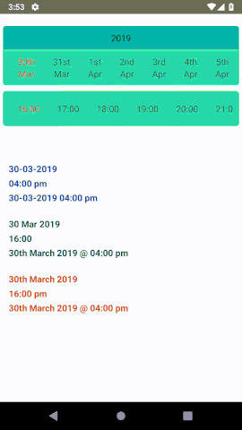
returnDateFormat(optional) String:
This is used to get date in specific format when date is selected. Default is “DD-MM-YYYY”.
returnTimeFormat(optional) String:
This is used to get time in specific format when time is selected. Default is “hh:mm a”.
returnDateTimeFormat(optional) String:
This is used to get datetime object in specific format when datetime function is implemented.
onDateSelected(optional) Function:
This is the function call when the date is selected from the date picker. This will return the date in returnDateFormat given above.
onTimeSelected(optional) Function:
This is the function call when the time is selected from the time picker. This will return the time in returnTimeFormat given above.
onDateTimeSelected(optional) Function:
It’s called when the date or time is selected from the picker. This will return the date in returnDateTimeFormat given above. This will return the object with selected date, selected time and both datetime combined.

Thanks for reading this article. Hope this will help you to create great product 
